
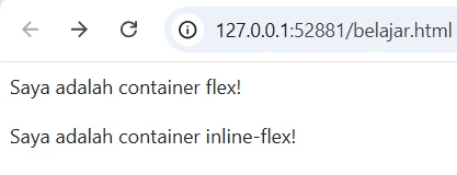
1. Mengaktifkan Flexbox
Flexbox memungkinkan kita mengatur tata letak elemen dengan lebih fleksibel. Untuk membuat container flex, kita bisa menggunakan .d-flex atau .d-inline-flex.
<!DOCTYPE html>
<html lang="id">
<head>
    <meta charset="UTF-8">
    <meta name="viewport" content="width=device-width, initial-scale=1.0">
    <title>Flexbox Bootstrap</title>
    <link href="https://cdn.jsdelivr.net/npm/bootstrap@5.3.0/dist/css/bootstrap.min.css" rel="stylesheet">
</head>
<body>

    <div class="d-flex p-2 bd-highlight">Saya adalah container flex!</div>

    <div class="d-inline-flex p-2 bd-highlight">Saya adalah container inline-flex!</div>

</body>
</html>
berikut hasilnya:
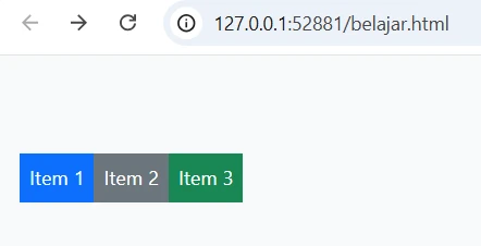
2. Arah (Direction)
Kita bisa mengatur arah elemen dalam flexbox menggunakan .flex-row (default), .flex-row-reverse, .flex-column, dan .flex-column-reverse.
<!DOCTYPE html>
<html lang="id">

<head>
    <meta charset="UTF-8">
    <meta name="viewport" content="width=device-width, initial-scale=1.0">
    <title>Flexbox Bootstrap</title>
    <link href="https://cdn.jsdelivr.net/npm/bootstrap@5.3.0/dist/css/bootstrap.min.css" rel="stylesheet">
</head>

<body>

    <div class="d-flex flex-row bd-highlight mb-3">
        <div class="p-2 bd-highlight bg-primary text-white">Item 1</div>
        <div class="p-2 bd-highlight bg-secondary text-white">Item 2</div>
        <div class="p-2 bd-highlight bg-success text-white">Item 3</div>
    </div>

    <div class="d-flex flex-column bd-highlight">
        <div class="p-2 bd-highlight bg-danger text-white">Item 1</div>
        <div class="p-2 bd-highlight bg-warning text-dark">Item 2</div>
        <div class="p-2 bd-highlight bg-info text-white">Item 3</div>
    </div>

</body>

</html>
berikut hasilnya:

3. Justify Content (Penempatan Elemen)
Kita bisa mengatur posisi elemen di dalam flex container dengan .justify-content-start, .justify-content-center, .justify-content-end, .justify-content-between, .justify-content-around, dan .justify-content-evenly.
<!DOCTYPE html>
<html lang="id">

<head>
    <meta charset="UTF-8">
    <meta name="viewport" content="width=device-width, initial-scale=1.0">
    <title>Flexbox Bootstrap</title>
    <link href="https://cdn.jsdelivr.net/npm/bootstrap@5.3.0/dist/css/bootstrap.min.css" rel="stylesheet">
</head>

<body>

    <div class="d-flex justify-content-center bg-light p-3">
        <div class="p-2 bg-primary text-white">Item 1</div>
        <div class="p-2 bg-secondary text-white">Item 2</div>
        <div class="p-2 bg-success text-white">Item 3</div>
    </div>

</body>

</html>
berikut hasilnya:

4. Align Items (Posisi Elemen Secara Vertikal)
Untuk mengatur posisi elemen secara vertikal, gunakan .align-items-start, .align-items-center, dan .align-items-end.
<!DOCTYPE html>
<html lang="id">

<head>
    <meta charset="UTF-8">
    <meta name="viewport" content="width=device-width, initial-scale=1.0">
    <title>Flexbox Bootstrap</title>
    <link href="https://cdn.jsdelivr.net/npm/bootstrap@5.3.0/dist/css/bootstrap.min.css" rel="stylesheet">
</head>

<body>

    <div class="d-flex align-items-center bg-light p-3" style="height: 200px;">
        <div class="p-2 bg-primary text-white">Item 1</div>
        <div class="p-2 bg-secondary text-white">Item 2</div>
        <div class="p-2 bg-success text-white">Item 3</div>
    </div>

</body>

</html>
berikut hasilnya:
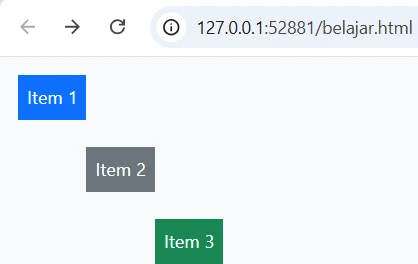
5. Align Self (Posisi Satu Elemen Secara Mandiri)
Gunakan .align-self-start, .align-self-center, atau .align-self-end untuk mengatur posisi masing-masing item secara individual.
<!DOCTYPE html>
<html lang="id">

<head>
    <meta charset="UTF-8">
    <meta name="viewport" content="width=device-width, initial-scale=1.0">
    <title>Flexbox Bootstrap</title>
    <link href="https://cdn.jsdelivr.net/npm/bootstrap@5.3.0/dist/css/bootstrap.min.css" rel="stylesheet">
</head>

<body>

    <div class="d-flex bg-light p-3" style="height: 200px;">
        <div class="p-2 align-self-start bg-primary text-white">Item 1</div>
        <div class="p-2 align-self-center bg-secondary text-white">Item 2</div>
        <div class="p-2 align-self-end bg-success text-white">Item 3</div>
    </div>

</body>

</html>
berikut hasilnya:
6. Wrap (Melipat Elemen)
Gunakan .flex-wrap untuk memungkinkan item flex berpindah ke baris baru jika tidak cukup ruang.
<!DOCTYPE html>
<html lang="id">

<head>
    <meta charset="UTF-8">
    <meta name="viewport" content="width=device-width, initial-scale=1.0">
    <title>Flexbox Bootstrap</title>
    <link href="https://cdn.jsdelivr.net/npm/bootstrap@5.3.0/dist/css/bootstrap.min.css" rel="stylesheet">
</head>

<body>

    <div class="d-flex flex-wrap bg-light p-3">
        <div class="p-2 bg-primary text-white">Item 1</div>
        <div class="p-2 bg-secondary text-white">Item 2</div>
        <div class="p-2 bg-success text-white">Item 3</div>
        <div class="p-2 bg-danger text-white">Item 4</div>
        <div class="p-2 bg-warning text-dark">Item 5</div>
    </div>

</body>

</html>
berikut hasilnya:

7. Order (Mengatur Urutan Elemen)
Gunakan .order-1, .order-2, .order-3, dll., untuk mengatur urutan tampilan elemen.
<!DOCTYPE html>
<html lang="id">

<head>
    <meta charset="UTF-8">
    <meta name="viewport" content="width=device-width, initial-scale=1.0">
    <title>Flexbox Bootstrap</title>
    <link href="https://cdn.jsdelivr.net/npm/bootstrap@5.3.0/dist/css/bootstrap.min.css" rel="stylesheet">
</head>

<body>

    <div class="d-flex bg-light p-3">
        <div class="p-2 order-3 bg-primary text-white">Item 1</div>
        <div class="p-2 order-1 bg-secondary text-white">Item 2</div>
        <div class="p-2 order-2 bg-success text-white">Item 3</div>
    </div>

</body>

</html>
berikut hasilnya:

8. Grow & Shrink (Ukuran Fleksibel)
Gunakan .flex-grow-1 agar item bisa mengisi ruang kosong yang tersedia.
<!DOCTYPE html>
<html lang="id">

<head>
    <meta charset="UTF-8">
    <meta name="viewport" content="width=device-width, initial-scale=1.0">
    <title>Flexbox Bootstrap</title>
    <link href="https://cdn.jsdelivr.net/npm/bootstrap@5.3.0/dist/css/bootstrap.min.css" rel="stylesheet">
</head>

<body>

    <div class="d-flex bg-light p-3">
        <div class="p-2 flex-grow-1 bg-primary text-white">Item 1</div>
        <div class="p-2 bg-secondary text-white">Item 2</div>
        <div class="p-2 bg-success text-white">Item 3</div>
    </div>

</body>

</html>
berikut hasilnya:

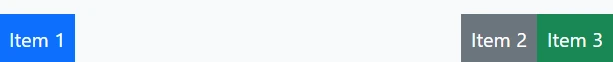
9. Auto Margin (Membuat Jarak Otomatis)
Gunakan .me-auto untuk mendorong item ke kanan dan .ms-auto untuk mendorong item ke kiri.
<!DOCTYPE html>
<html lang="id">

<head>
    <meta charset="UTF-8">
    <meta name="viewport" content="width=device-width, initial-scale=1.0">
    <title>Flexbox Bootstrap</title>
    <link href="https://cdn.jsdelivr.net/npm/bootstrap@5.3.0/dist/css/bootstrap.min.css" rel="stylesheet">
</head>

<body>

    <div class="d-flex bg-light p-3">
        <div class="p-2 me-auto bg-primary text-white">Item 1</div>
        <div class="p-2 bg-secondary text-white">Item 2</div>
        <div class="p-2 bg-success text-white">Item 3</div>
    </div>

</body>

</html>
berikut hasilnya:
Artikel Lainnya Dengan Kategori Terkait :
1. Belajar Bootstrap #1 Fundamental Bootstrap
2. Belajar Bootstrap #10 CSS Variables Bootstrap
3. Belajar Bootstrap #11 Optimize Bootstrap
4. Belajar Bootstrap #12 Mengenal sistem kolom di Bootstrap
5. Belajar Bootstrap #13 Panduan lengkap gutters di Bootstrap
6. Belajar Bootstrap #14 Penjelasan sederhana utilities untuk layout di Bootstrap
7. Belajar Bootstrap #15 Penjelasan Z-index dalam Bootstrap
8. Belajar Bootstrap #16 Reboot Bootstrap
9. Belajar Bootstrap #17 Typography di Bootstrap
10. Belajar Bootstrap #18 Gambar di Bootstrap
11. Belajar Bootstrap #19 Table di Bootstrap part 1
12. Belajar Bootstrap #2 Alasan menggunakan Bootstrap
13. Belajar Bootstrap #20 Table di Bootstrap part 2
14. Belajar Bootstrap #21 Bootstrap Figures
15. Belajar Bootstrap #22 Penjelasan Form di Bootstrap
16. Belajar Bootstrap #23 Form Controls di Bootstrap
17. Belajar Bootstrap #24 Penjelasan Bootstrap Select
18. Belajar Bootstrap #25 Checkbox dan Radio Button di Bootstrap
19. Belajar Bootstrap #26 Range input di Bootstrap
20. Belajar Bootstrap #27 Input Group di Bootstrap
21. Belajar Bootstrap #28 Penjelasan Floating Labels di Bootstrap
22. Belajar Bootstrap #29 Layout Form di Bootstrap
23. Belajar Bootstrap #3 Persiapan Sebelum Belajar Bootstrap
24. Belajar Bootstrap #30 Validasi Form di bootstrap
25. Belajar Bootstrap #31 Accordion di Bootstrap
26. Belajar Bootstrap #32 Apa itu Bootstrap Alerts?
27. Belajar Bootstrap #33 Apa itu Badges di Bootstrap?
28. Belajar Bootstrap #34 Apa itu Breadcrumb di Bootstrap?
29. Belajar Bootstrap #35 Penggunaan Tombol (Buttons) di Bootstrap
30. Belajar Bootstrap #36 Button Group di Bootstrap
31. Belajar Bootstrap #37 Cards di Bootstrap part 1
32. Belajar Bootstrap #38 Cards di Bootstrap part 2
33. Belajar Bootstrap #39 Cards di Bootstrap part 3
34. Belajar Bootstrap #40 Apa itu Carousel di bootstrap
35. Belajar Bootstrap #41 Close Button di Bootstrap
36. Belajar Bootstrap #42 Apa itu Collapse di Bootstrap
37. Belajar Bootstrap #43 Dropdowns di Bootstrap part 1
38. Belajar Bootstrap #44 Dropdowns di Bootstrap part 2
39. Belajar Bootstrap #45 List Group di Bootstrap
40. Belajar Bootstrap #46 Modal di Bootstrap
41. Belajar Bootstrap #47 Navs dan tabs di Bootstrap
42. Belajar Bootstrap #48 Navbar di Bootstrap part 1
43. Belajar Bootstrap #49 Navbar di Bootstrap part 2
44. Belajar Bootstrap #5 Menggunnakan Bootstrap lewat unduhan manual
45. Belajar Bootstrap #50 Offcanvas di Bootstrap
46. Belajar Bootstrap #51 Pagination di Bootstrap
47. Belajar Bootstrap #52 Popover di Bootstrap
48. Belajar Bootstrap #53 Progress di Bootstrap
49. Belajar Bootstrap #54 Apa itu Scrollspy
50. Belajar Bootstrap #55 Bootstrap Spinners
51. Belajar Bootstrap #56 Toats di Bootstrap
52. Belajar Bootstrap #57 Tooltips di Bootstrap
53. Belajar Bootstrap #58 Clearfix dalam Bootstrap
54. Belajar Bootstrap #59 Colored Links di Bootstrap
55. Belajar Bootstrap #6 Cara Membuat Container Pada Bootstrap
56. Belajar Bootstrap #60 Ratios di Bootstrap
57. Belajar Bootstrap #61 Position Bootstrap
58. Belajar Bootstrap #62 Visually Hidden Bootstrap
59. Belajar Bootstrap #63 Stretched Link Bootstrap
60. Belajar Bootstrap #64 Text Truncation di Bootstrap
61. Belajar Bootstrap #65 Utility API di Bootstrap
62. Belajar Bootstrap #66 Background di Bootstrap
63. Belajar Bootstrap #67 Border di Bootstrap
64. Belajar Bootstrap #68 Bootstrap Colors
65. Belajar Bootstrap #69 Display Property di Bootstrap
66. Belajar Bootstrap #7 Memahami dan menerapkan grid
67. Belajar Bootstrap #70 Flexbox di Bootstrap
68. Belajar Bootstrap #71 Float Utility di Bootstrap
69. Belajar Bootstrap #72 Bootstrap Interactions
70. Belajar Bootstrap #73 Overflow di Bootstrap
71. Belajar Bootstrap #74 Position dalam Bootstrap
72. Belajar Bootstrap #75 Shadows di Bootstrap
73. Belajar Bootstrap #76 Bootstrap Sizing
74. Belajar Bootstrap #77 Spacing di Bootstrap
75. Belajar Bootstrap #78 Text Utilities di Bootstrap
76. Belajar Bootstrap #79 Vertical Alignment di Bootstrap
77. Belajar Bootstrap #8 Warna Tema dan Cara Penggunaannya
78. Belajar Bootstrap #80 Visibility di Bootstrap